
Tips for Designing a Beautiful Ecommerce Mobile app

As the number of worldwide smartphone customers continues to rise, designing websites for mobile-first experience has become prevalent practice. For a business website, responsive web design is undoubtedly an absolute requirement.
But companies that want to remain ahead of the contest and offer their clients the best possible digital shopping experience are constantly turning to an even more optimized medium: mobile apps.
One of the greatest things you can do to expand your e-commerce company is designing a mobile app. It is an optimal reaction to modern consumer requirements and behaviors, given that in 2018 more than 50% of all website traffic globally was produced through mobile apps.
Specifically adapted to the mobile experience, applications make navigation much easier and more effective for mobile users ' ever-growing population. This is particularly crucial for e-commerce, where you want to depend on a custom-tailored platform to present your products and not only make shopping easy but also an enjoyable experience.
While, many design principles stay the same, e-commerce app design remains a particular chapter on its own. To get the most out of it and impress customers, here are the essential things to be careful about so you can have the ideal online store app.
1 - Simple & Uncluttered User Interface :
When developing an eCommerce mobile app's user interface (UI), there are two significant considerations to maintain at the forefront of your mind:
the first is that a mobile device's screen size is much lower than a full-size desktop or laptop, so you're restricted to how much material you can display on a single screen. And the second is that you should design your app so that your clients can use it as easily as possible and purchase something, most importantly.
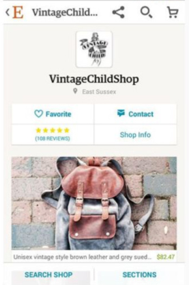
You should concentrate on a simple, uncluttered design on your app's home screen that highlights your recent promotions or most famous products alongside a closely thought-out, easy-to-find worldwide navigation scheme and search features.
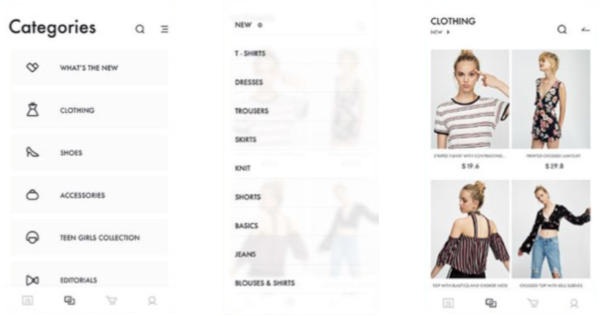
2 - Condensed & Consistent Navigation :
Unlike eCommerce websites, where you will usually see big mega-menus listing all categories, sections, and promotions with a mobile app's lower screen size, you're restricted to how many products you can efficiently display in global navigation.
To simplify the user discovery process, you should guarantee that your menu is continuously and obviously placed throughout the app and that only the most significant categories / sections are contained in your menu list.
Also, every menu element should be written and readily understood using a single word.
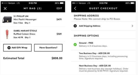
3 - Avoid a long Sign-up & checkout process :
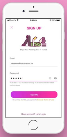
Customers don't like a lengthy multi-page sign-up or checkout process, which is double for users of the mobile app. They just don't have patience.
Make the method simpler by enabling new clients to register and buy as a guest using their preferred social network.
You should also offer to store user information to save them from having to repeat the process for any future purchases. For those inevitable repetitive assignments, use auto-complete as a bonus.
4 - Always display a prominent 'Add to cart' button :
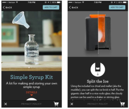
One of the most important things to do when a customer discovers a product they want to buy is to make sure they can finish the purchase as rapidly as possible. You'll more than likely lose the sale if they have to take too many steps.
Having an always in perspective and prominent ' buy now ' or ' add to cart ' button on product screens will assist simplify the customer's buying experience and will definitely assist enhance your revenues.
5 - The "Three-tap" rule :
When designing a mobile app or website for eCommerce, keeping its structure clear is essential. The Three-Tap Rule states: a customer should not take more than 3 taps to reach any of the products he wishes to purchase.
You can arrange your products in the following order to fulfill this requirement:
I - categories
II - Sub-categories
III - Products
But you can also use tags to organize products into particular categories such as "Christmas Sale," "Gift for your Valentine," etc.
Obviously, the search bar is also an essential component of UX design for mobile apps and sites. It enables consumers get to the product they were looking for directly.
Think about the Smart Search if you want to provide even better features. Several possible alternatives and suggestions to choose from will be presented as users type in the first letters. So, not only will you save time for customers and enhance their Buyer Journey, but you will also be able to demonstrate some hot deals up front.
The Three-Tap rule can readily be converted into a general idea of eCommerce Mobile App Design for you: the less steps all procedures take (such as browsing products, adding to the cart, paying), the better.
6 - Alleviate Impatience with a Progress bar :
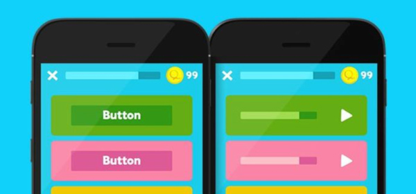
As mentioned above, users don't like multi-page signup forms, but if your signup or checkout method ends up being longer than suggested, a progress bar should be used to let your clients understand precisely how many more screens they will have to suffer before the process is lastly completed.
7 - Allow users to mark 'Favourites' :
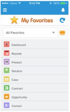
Customers like to browse before eventually purchasing something, just like in brick and mortar shops. You can make the browsing method pleasant on your mobile app by allowing customers to add products to a' wishlist' or' favourites' section and then enable them to revisit their gathered lists to give them the extra time they need to decide which product to purchase.
8 - Consider the Thumb-friendly-zone :
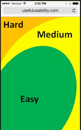
With research indicating that 70-90% of the world's population is right-handed, you should put your app's main regions and features (such as the ' add to cart ' button) within simple reach of the right-hand ' thumb-friendly-zone.
Something you should always keep this in mind when developing your app is that as smartphones gradually get larger, the ' thumb-friendly-zone ' will reduce dramatically.
9 - Ensure Customer data is secure :

The most significant thing you can do for your customers is to make sure that their private and monetary information is secure, even if it risks blowing your development budget or delaying launch.
Spend that little extra time and money creating an app that's as safe as possible, it really depends on your reputation and company. Whether you sell the best products or have the fastest and most intuitive app doesn't matter, if a client loses faith in your app, they're never going to come back.
Conclusion :
Investing time and resources to develop a lovely, user-oriented e-commerce app will pay off your company ten times as much. That's why keeping the launch off until you've covered everything is better than rolling out an app that won't deliver an effortless and tailor-made experience. Pay attention to all the aspects we've discussed and you're going to be on your way, but don't forget the ultimate problem: safety.
Make sure your app is designed to protect the data of your customers and do not hesitate to assure them of this. After all, what keeps your brand reputation spotless and keeps satisfied customers coming back is a secure and reliable app.
About The Author

Related Blog
View All-

Featured Android & iOS Apps of May 2017 ? TheGreatApps
Featured Android & iOS Apps of May 2017: Download These Best New Apps Again we are back with the Featured Android & iOS Apps of May 2017 as we are doing at the end of the month. These are the Best New Apps that you've missed in the last month. We know ...
-

These Qualities Make Game Apps Highly Successful
When you take a critical look at all the game apps that have hit a 10 million download mark and also maintain at least 2 million active players at any given time, you will find certain qualities in them. So, all mobile app development companies now strive hard ...


